What needed to be solved
Build a brand for families and children that feels spontaneous and optimistic, while avoiding an aesthetic that is either too rigid or overly childish.
Visual identity · Web design
A joyful, flexible and recognisable identity for a children's universe: colour without clutter and personality without sacrificing legibility.
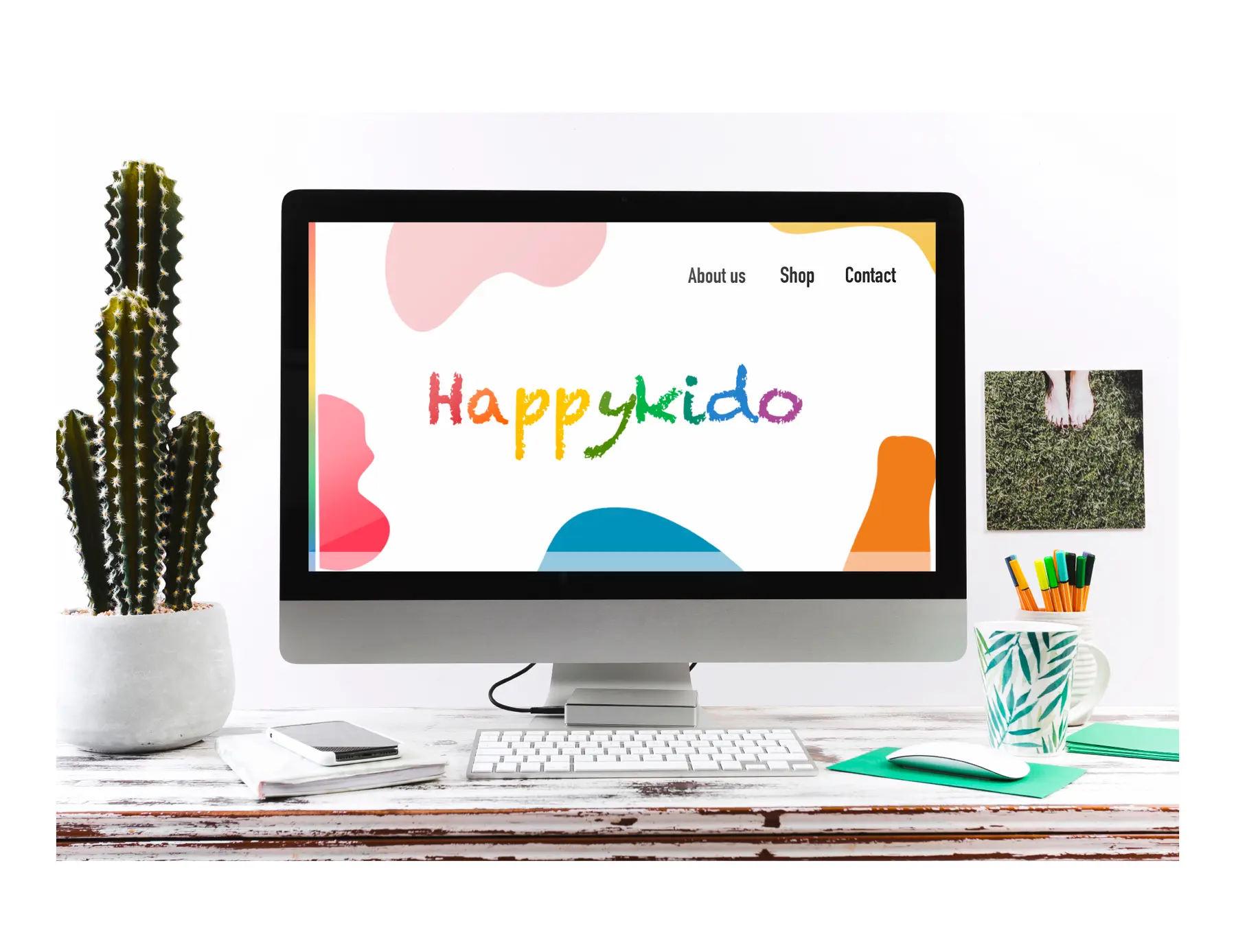
Build a brand for families and children that feels spontaneous and optimistic, while avoiding an aesthetic that is either too rigid or overly childish.
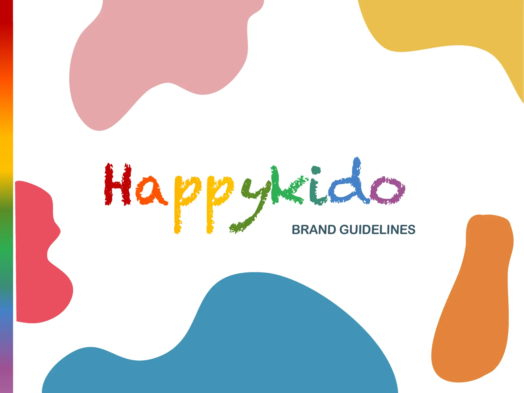
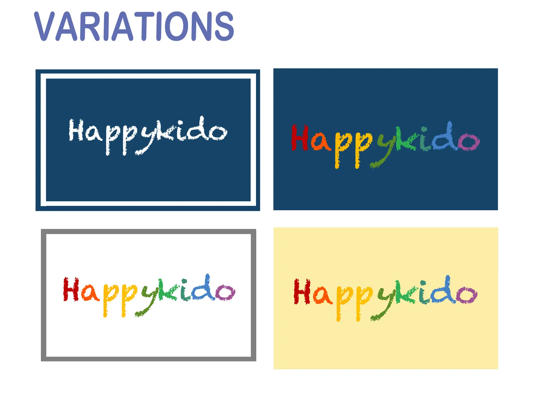
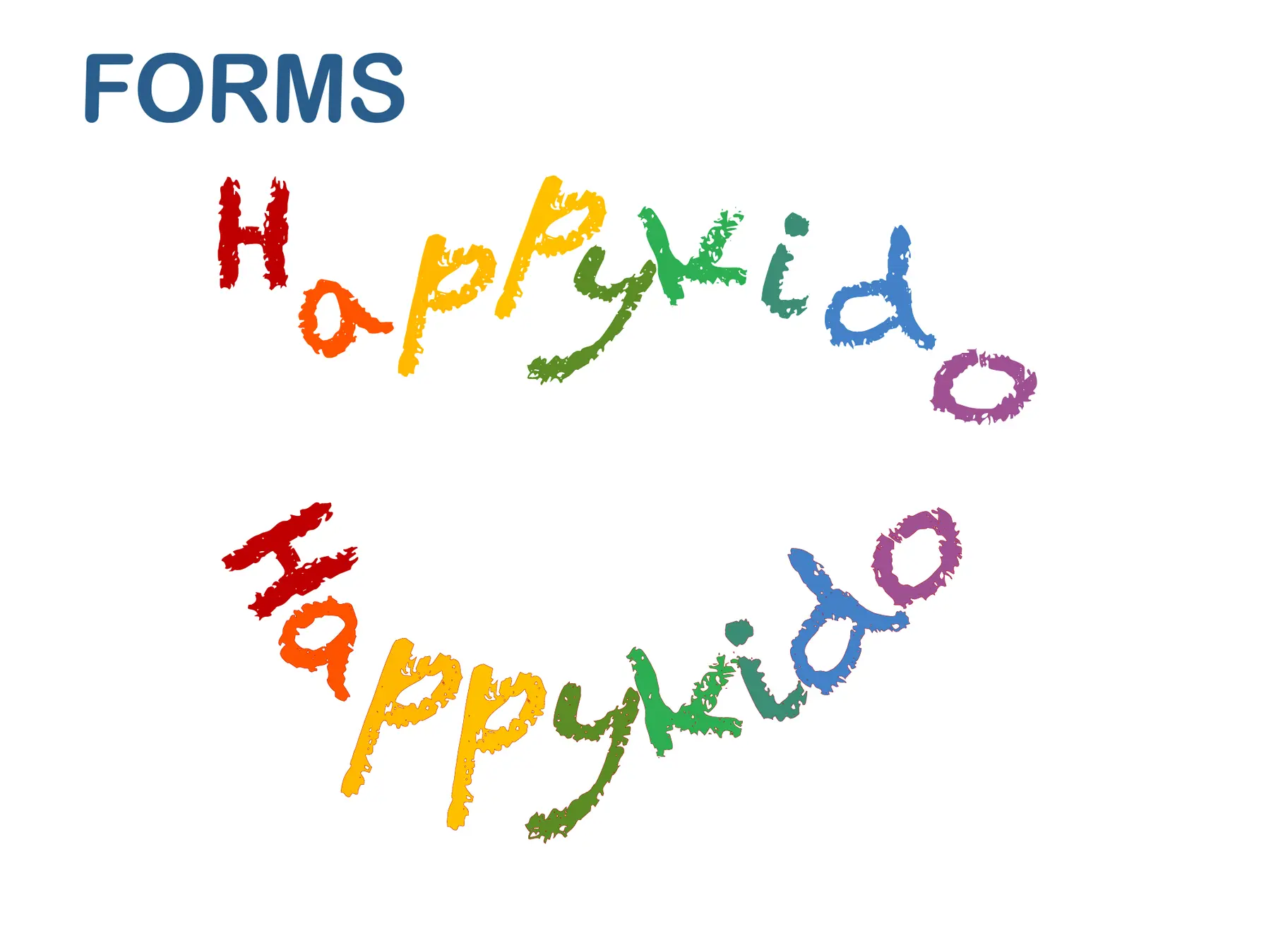
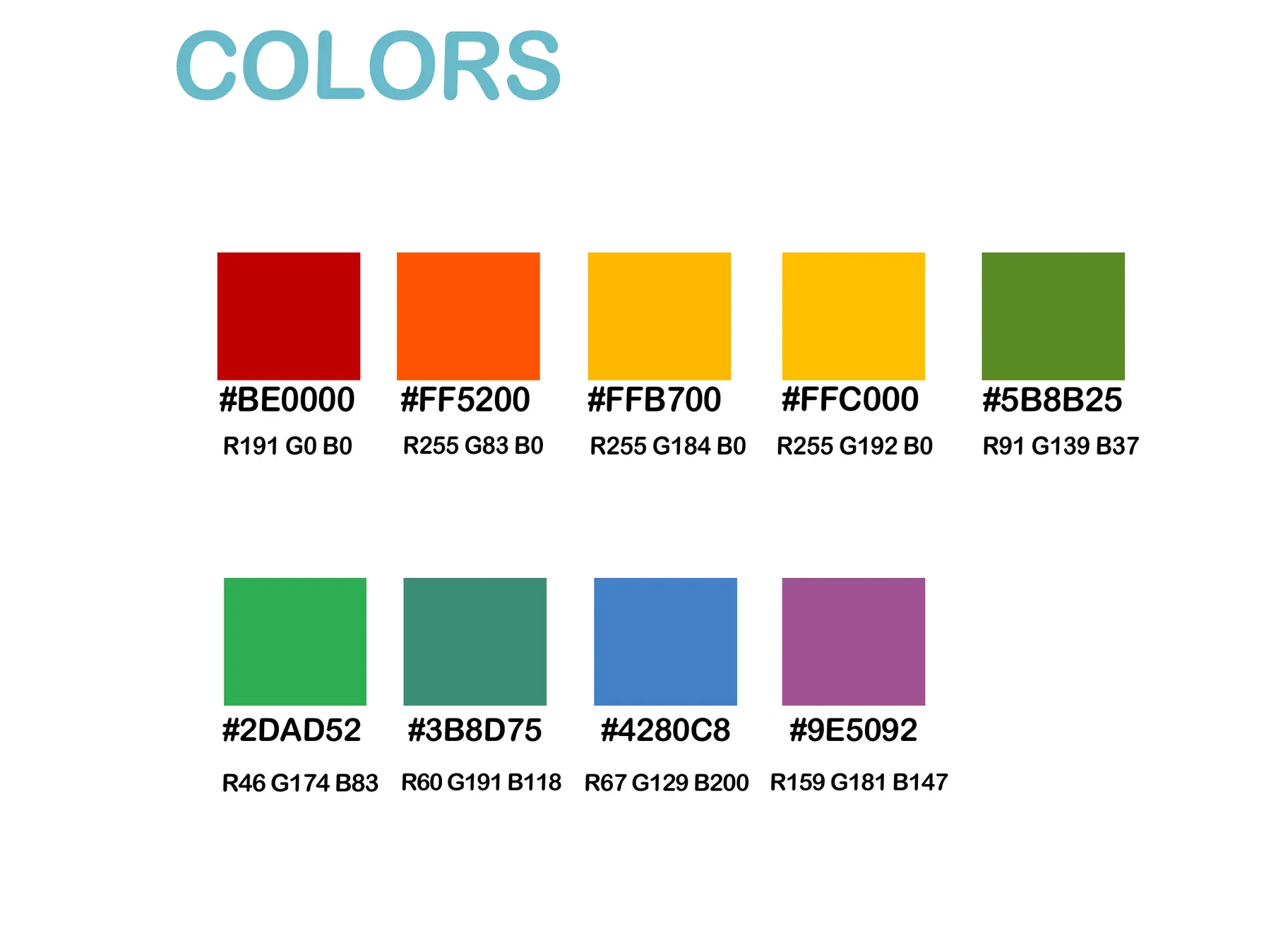
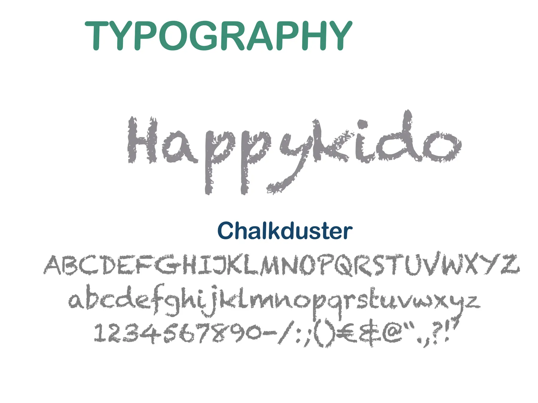
The HappyKido wordmark sits at the heart of the system. Its irregular linework brings warmth and is paired with a broad yet organised palette that adapts to light and dark backgrounds as well as digital applications.
A recognisable visual language that translates easily across the website, communications and future brand assets, documented through logo variations, colour and typographic guidelines.
AREAS OF WORK
COLOUR PALETTE
PROCESS
Defining a positive, creative and approachable brand that is easy to remember.
Developing variants that remain legible across different backgrounds.
Translating the visual language into a clear, bright web interface.